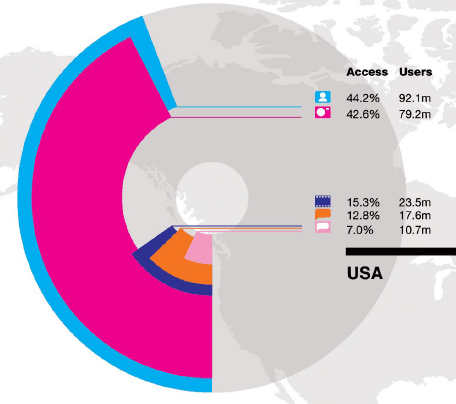
The folks over at Global Web Index, put together a nice little overview of global social media activity across the web. They interviewed 32,000 users in 16 countries to put together the information. The data comes in the form of a chart that is too large to include in this post so I took a few screenshots.

The image icons are broken down as follows:
- manage a social networking profile (light blue)
- upload photos online (purple)
- upload a video online (dark blue)
- written your own blog (orange)
- use a micro-blogging service (pink)
It’s interesting to compare a few things when you look at the chart as a whole, here are a few things that jumped out at me:
- 39.6% of users in Germany uploaded a video online vs around 15% in the US
- 46% of users in Japan have written their own blog vs 12.8% in the US
- 57.5% of users in India manage a social networking profile vs 44.2% in the US
- Microblogging in general is still not widely used across the 16 countries that participated in the survey
Overall is this survey going to impact your social media strategy? Probably not. Most of the surveys that come out usually have quite varying numbers so keep that in mind when going through this. However, this chart is valuable in terms of comparing usage across geographic locations.
I wish the report had information on trends over the past few years and comparisons across the various countries involved but it’s certainly nice to look at. It might be worth your time to check out the full chart for all 16 countries.

Absolute eye opener and learning material
Absolute eye opener and learning material
good article thanks.
thanks very much,